
")
One of the things most business owners struggle with the most is aligning their brand with their Instagram feeds. Designers struggle with this also. Below are 3 steps to take to create that cohesive look.
- Utilize your color palette.
Below is my color palette. Anytime I go to create a new graphic, I try to use one of these colors. If I’m showcasing client work, I’ll use one of these colors below as the background and use the client’s white or black logo. Then I’ll use the following posts in the carousel to use the client’s specific brand colors.

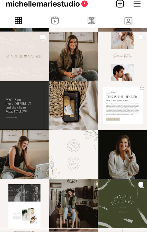
Check out the example of my Instagram feed below.
2. Utilize your brand color palette in your photography.
When planning my recent brand photoshoot, I made sure that I wore neutral colors that matched my palette. I wore mostly black and white tops. I also had a green overshirt that I wore. I also picked a photographer that had a darker moody style of editing. Below are some examples of my outfits.


If you cannot hire a brand photographer at this time, choose stock images that match your brand palette. After doing a quick search on Unsplash, here are some images that I would pick out for my own brand to post on Instagram.


3. Put it together!
Once you have a good collection of images and graphics that you’ve made, piece everything together in a scheduling app like Later, Planoly or UNUM. I like using an app to see what different combinations would look like if I moved around the posts. I typically plan 3 posts at a time and look to my current feed to pick what colors I want to work with next.
Here’s an example of what I would do when I’m first thinking of how I want the feed to look. I then go in afterwards and create the graphics that I want. Whether that be client logo features, quote graphics or infographics.

Bonus tip!
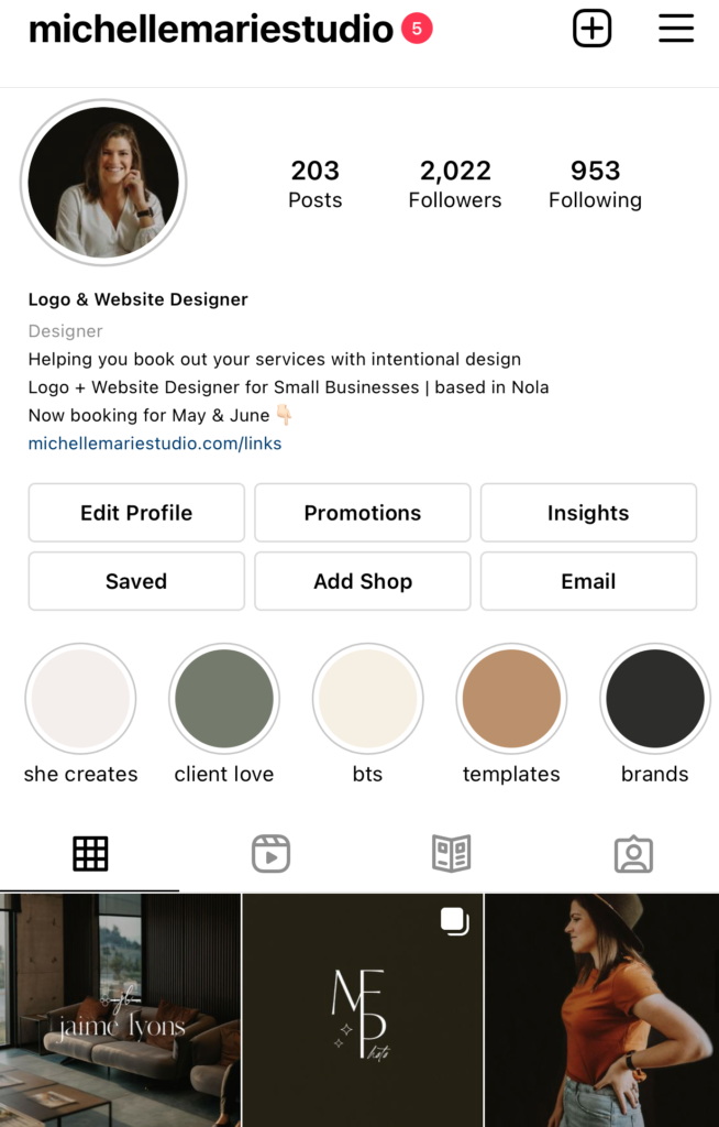
Create Highlight covers to match your feed. Easiest way to do this is to use your brand colors. Check out my highlight covers below.
Ready to take your designs to the next level? Read about how I taught myself Graphic Design here and the different resources that I found helpful in my journey.
